
Google's Algorithm Change Demands Mobile Response
Google’s mysterious algorithm that drives all web results is a thorn in the side of marketing, SEO, and web development firms. All of the effort put into getting their website to show up near the top of a Google search can be lost when Google makes change to their algorithm.
So, when Google announced that the newest twist to their almighty algorithm would penalize websites that weren’t mobile friendly; fear rippled through the web world. Quickly titled “Mobilegeddon” by the media, this update meant that good SEO rankings would be lost if they weren’t on a mobile-friendly site.
Why Is A Mobile Site So Important?
The reason that Google was placing such a huge emphasis on mobile web usage is because it has quickly overtaken desktop usage. People are no longer tied solely to a desktop when they are searching for restaurants, check email, or scroll through Facebook. With the increase in use of mobile devices, it has become imperative to have a website that can be easily viewed on all sizes of screens.
Responsive Or Mobile Website
There are two main options for making a site mobile compliant, which will adjust to different screen sizes. Two of the most popular options are the responsive web design and mobile web design.
A mobile web design utilizes programming of a separate website from the desktop version. A mobile site is designed to make viewing the website much easier on a smaller screen than compared to the desktop version. Two drawbacks to mobile design is that it requires maintaining two different site versions and is usually limited in the amount of pages that can be viewed.
The alternative option is a responsive web design, which intuitively responds (or changes) based on the type of device the viewer is using. A site done with responsive programming only requires on version of the website.
At this time, Google is not giving preference to websites who have a responsive website versus a mobile website, but they have stated that a responsive site is a better choice for usability.
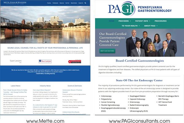
Taking all of this information into consideration, AdAbility recently assisted Pennsylvania Gastroenterology Consultants and Mette, Evans & Woodside law firm with rebuilding their websites using a responsive design. Knowing the trend in mobile internet usage, we opted for the responsive design over the mobile design because a responsive site by its very nature lends itself to a more open look and feel that works on any device.
Part of the process included AdAbility programming and transitioning all content from a defined layout and tables to content boxes that allowed for a re-flow of information when the site was pulled up on any device. Additionally, AdAbility was able to rework both companies’ websites for better SEO since now each only had one website to make changes to rather than two sites, both a desktop version and a mobile version.