
Chicago Creatives Develop a Font Using Shapes from Gerrymandered Districts
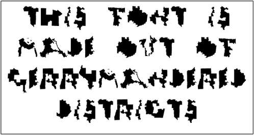
Chicago designers, Ben Doessel and James Lee, recently created their own font out of the actual gerrymandered shapes of congressional districts all across the U.S. The two coworkers from an advertising agency in Chicago were initially inspired by the shape of their own Illinois 4th district, which looks like the letter ‘u’.
For those that don’t know, gerrymandering is a process of redistricting an electoral map for political gain. It has been a hotly debated topic for years now, with both Democrats and Republicans scorning the practice, but continuing to gain from it.
There are many ways gerrymandering can occur including Cracking (splitting a community into two or more districts), Packing (concentrating voters of one party in a single district), Sweetheart (where incumbents from both sides redistrict to ensure their re-election), and Prison-Based (where ineligible prisoners are counted in the district their prison is located).
The issue of gerrymandering has even been brought before the U.S. Supreme Court, only for the court to relegate the responsibility back to the states. The Pennsylvania Supreme Court recently redrew the congressional districts, with fewer county splits and higher compactness.
By creating this font, the Ugly Gerry team is hoping to raise awareness of this problem and pressure politicians to draw district lines more fairly, so everyone can receive a vote.
If you’d like to see the full alphabet by Doessel and Lee called “Gerry,” you can visit their website www.uglygerry.com and download it for free. They’ve also included a place to craft your own message using their font and tweet it.