
An Inside Look At The Brand Development Process
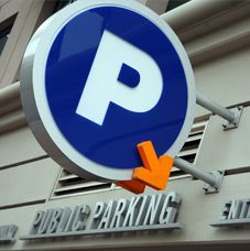
When RDH Consulting, a nationwide consultant in the parking industry, approached our creative team about invigorating their brand, it was an opportunity for AdAbility Marketing Communications to apply our know-how in a new industry. Like most drivers, most of our experience with the parking world revolved around finding an open spot to park. We had no idea of the expertise that went into the planning and managing of parking operations.
The first step was to rename RDH Consulting with a moniker that would better describe what the company did. One of the biggest challenges in naming a company today is being able to reserve a website domain name that matches. Many domains have already been snatched up. Another consideration is if the company wants to trademark their new name within a state or nationwide. Legal research is required to verify if other entities have incorporated under or trademarked similar names.
Optimum Parking Solutions Is Born
After careful consideration of various options, Optimum Parking Solutions was selected for the company’s new name. The consultancy provides innovative guidance and recommendations to the parking industry in all aspects of operations to maximize the value of their parking assets. So, the Optimum Parking Solutions name explained and encompassed all that is offered.
With the name selected, we were ready to begin exploring some concepts and designs that would differentiate the company and create a unique brand identity. In order to clarify the brand’s essence; a central idea, underlying concept, key messages and voice were explored.
Our creative team developed several brand identity concepts for consideration. Three critical aspects of the brand identity design include:
- Visual Elements – shape, lines, balance, symmetry, depth and other visual representations
- Color Selection - color palettes, hues and combinations to best project the brand
- Type Style – distinctive type styles / fonts that will communicate and reflect the identity
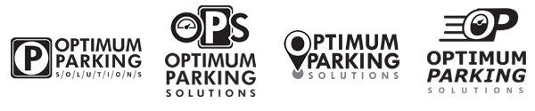
The next step in the branding process is the corporate identity concept phase, with the creation of a logo - a brand's focus point. The initial designs (above) were done in black & white, so that color did not influence the selection decision.
Adding Color
Color plays a key role in brand identity. Each color conveys a different emotion and can influence how your brand is perceived. Optimum Parking Solutions brand positioning is as a strong, innovative leader in the industry. Once the black & white logo design was selected, we developed three different color combination options (below).
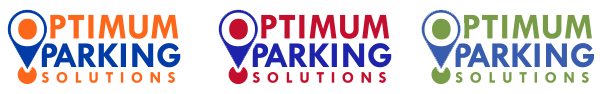
Both red and orange are seen as bold colors that convey confidence. Red expresses power and passion while orange is creative and enthusiastic. Blue and green are common colors but each give a different feeling. Blue means strength, integrity and dependable while green showcases growth and health. The combination that best portrayed OPS’s vision was red and blue, colors which represented being bold, innovative and dependable. The new brand identity was then applied to collateral materials including letterhead, envelope and business cards.
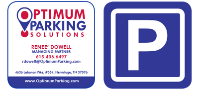
For the Optimum Parking Solutions business card, we opted for a creative twist. Instead of a traditional rectangle, the card is square with rounded corners. The entire back of the card is the universal “P” parking symbol. Everything about the card – the square shape – the rounded corners – the parking icon printed on the back - automatically communicates that Optimum is not a run-of-the-mill consultant.